Disclaimer: I did not work on Borderlands 4. The thoughts shared here are purely my own, coming from a gamer who also happens to work in the iUX field.
Borderlands 4 (BL4) launched just two weeks ago, and while the reviews have been pouring in about the gameplay, story, and performance issues, there’s been very little discussion about its user experience. I wanted to share my thoughts from a design perspective — and honestly, to get this off my chest after 50+ hours of gameplay.
The Main UI – Functional but Lacking Identity
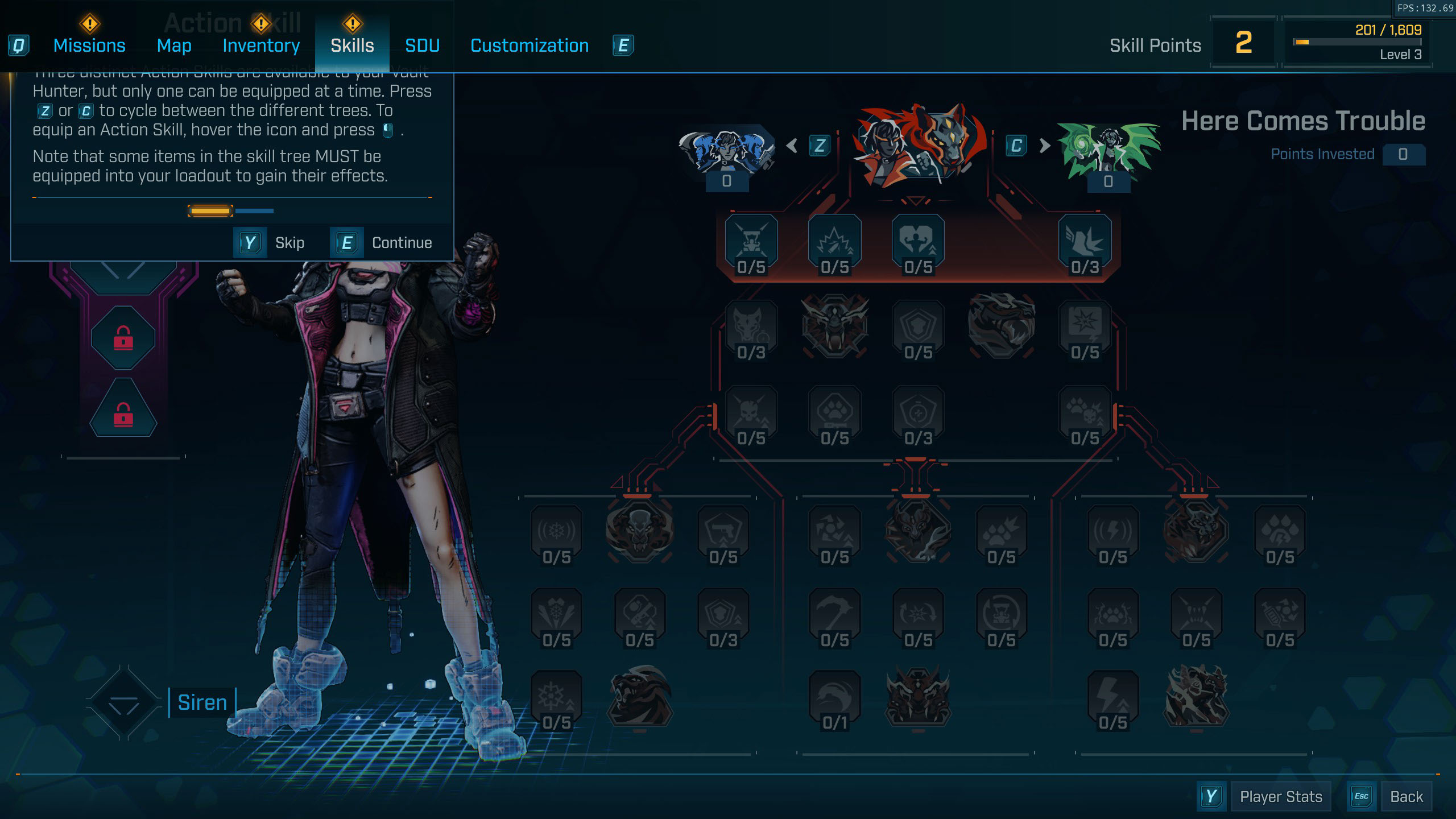
The first noticeable shift is the move to a full-screen UI. It’s undoubtedly cleaner and more accessible, but it feels like a step away from what gave previous titles their charm. Earlier Borderlands games featured HUDs that appeared diegetic — almost projected in front of the character — reinforcing immersion. The new layout feels safer but more generic. Small design touches, like curved edges or dynamic overlays, could’ve maintained the franchise’s unique personality while keeping it modern.
Hidden Currency – A Missed UX Opportunity
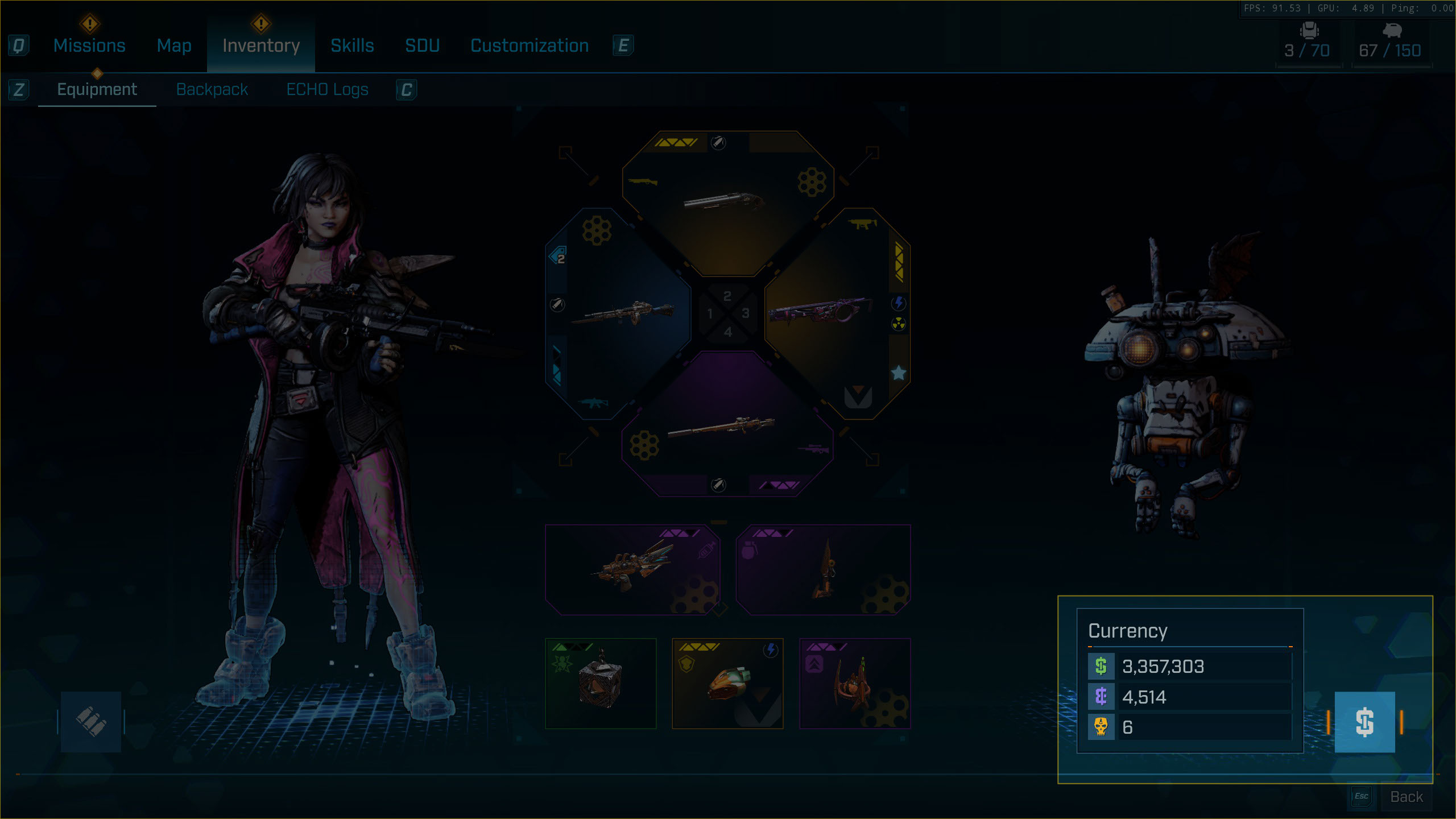
One surprising choice is hiding the in-game currency behind a hover interaction. This decision breaks a basic usability expectation — visibility of key information. When shopping or exploring, I constantly found myself guessing how much I had on hand. Even if the number becomes less relevant later in the game, it’s still an important anchor for decision-making, much like in real-world financial interfaces.
Inventory Filter System – A Useful Idea That Defaults Wrong
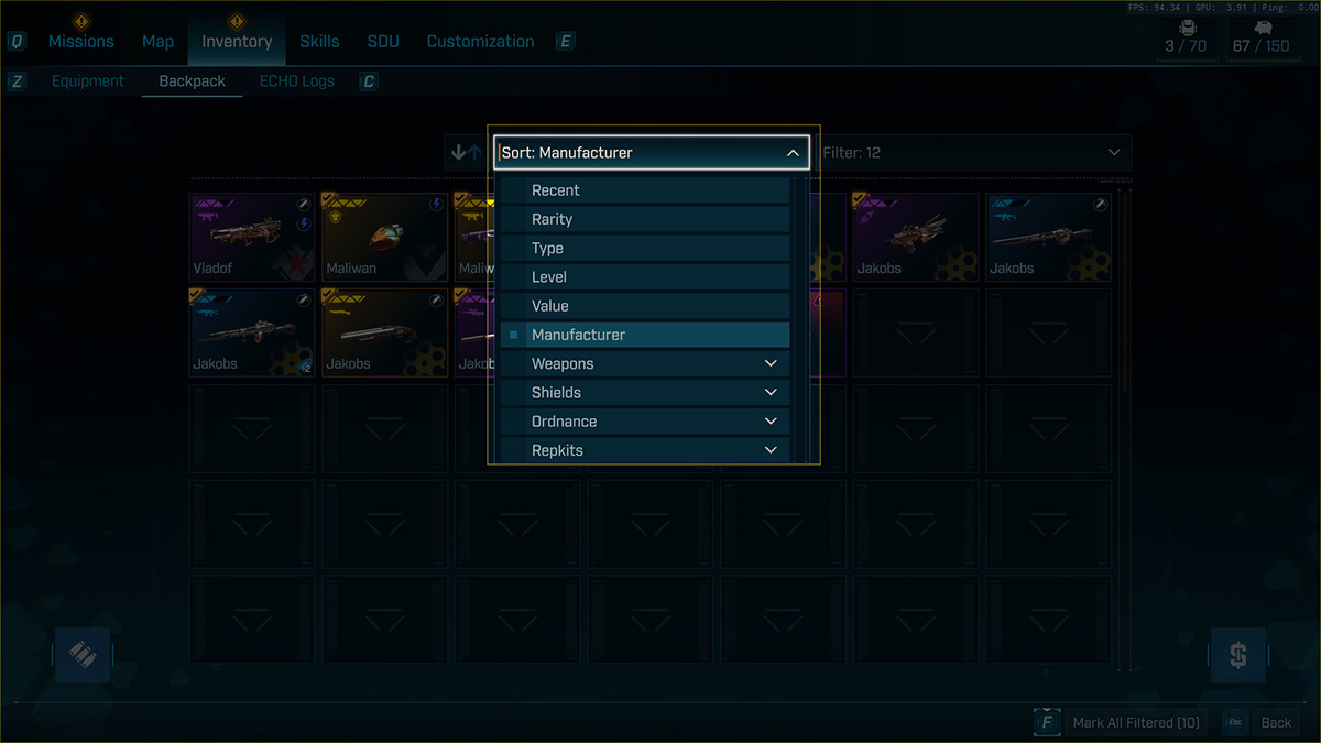
The addition of a filter system is a welcome improvement for managing the overwhelming amount of loot Borderlands is known for. However, it defaults to Manufacturer, which isn’t the most intuitive choice for most players. A more natural default might be Recent or Item Type, since players typically want to review what they’ve just picked up or organize by function.
Even better would be allowing players to set and save their own default filters, reducing the need to repeatedly adjust it. Small personalization options like this can have a big impact on long-term usability — especially in a game where inventory management is a constant task.
Item Comparison – Too Many Steps for a Simple Task
Item comparisons, a crucial part of any looter-shooter, feel unnecessarily fragmented. The current setup only shows partial comparisons, forcing players to open multiple screens just to see complete details. For example, passive perks — arguably more important than base stats — are inconsistently displayed. This inconsistency makes the system feel cumbersome rather than empowering.
A more seamless comparison view (something that dynamically displays both base stats and passives in one glance) could dramatically improve usability. The data is clearly there — it’s just not being surfaced effectively.


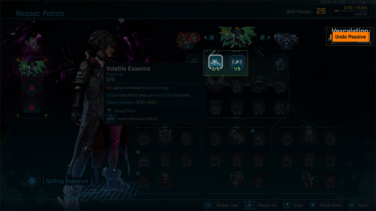
Skill Respecs – Overly Linear Interaction
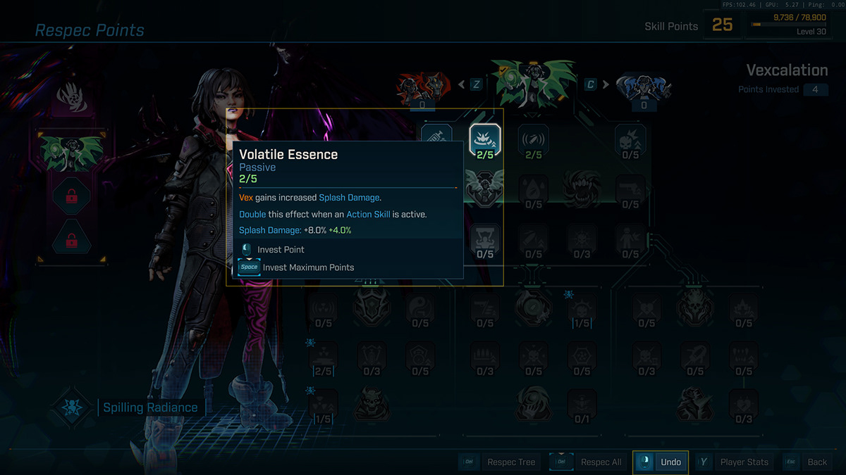
Respeccing skills uses a linear undo system that feels unnecessarily restrictive. Instead of having to “undo” point by point, a direct remove or reassign option would make the process more intuitive and player-friendly. The current approach slows down experimentation, which is counter to the freedom that defines the Borderlands experience.
Final Thoughts
Overall, I’m genuinely enjoying Borderlands 4 — the gameplay is engaging and the world-building remains stellar. But as a UX designer, I can’t help but notice how the interface feels more functional than inspired. It works, but it doesn’t delight.
The foundations are solid, but a few thoughtful adjustments could make the experience far more fluid and intuitive. Hopefully, future updates will refine these systems and bring back some of that bold, quirky identity that has always set Borderlands apart.